Tedeache
Support app for individuals with ADHD
This proposal consists of a hybrid app within the digital health and wellness sector, focused on providing comprehensive support for people with ADHD (Attention Deficit Hyperactivity Disorder).
The product is designed to improve organization, focus, time management, and routine tracking, addressing needs that are currently not met within a single platform.
According to the World Health Organization (WHO), over 4% of the global population has ADHD. In Spain, it is estimated that between 5% and 7% of children and adolescents are affected.
Daily challenges for an individual with ADHD include: organizational difficulties, time management issues, focus struggles, impulsivity, and a constant sense of being overwhelmed.
These difficulties can impact work performance, personal relationships, mental health, and, in some cases, lead to substance abuse or financial problems.
Our primary goal is to create value centered on people with ADHD, improving their organization and focus by studying their habits, motivations, and frustrations across academic, professional, and personal environments.
Additionally, this research seeks to understand how leading productivity and digital health apps operate both nationally and internationally. The aim is to identify trends, core functionalities, and differentiation strategies to establish a benchmark and detect innovation opportunities that set Tedeache apart as an all-in-one solution.
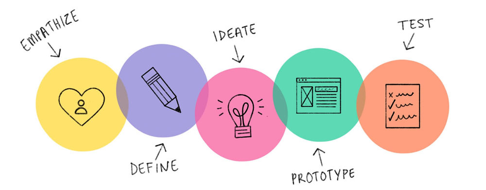
For this project, I followed the Design Thinking methodology, a user-centered iterative process that allowed me to explore the problem in depth before designing a solution. I began by empathizing with ADHD users, defining their real needs, ideating innovative features, prototyping in Figma, and validating with real users.
I analyzed the market to examine how current ADHD, productivity, and digital health apps function.
It is a tool to evaluate competitors' products and services, although it can also be applied internally to analyze one's own. It allows for the identification of strengths and features, as well as a detailed analysis of the competition, understanding their most effective strategies and practices.
The goal was to analyze applications related to ADHD, routines, and concentration; Inflow and RoutineFlow as direct competition, and Forest as indirect competition; to identify strengths, weaknesses, and key functionalities.
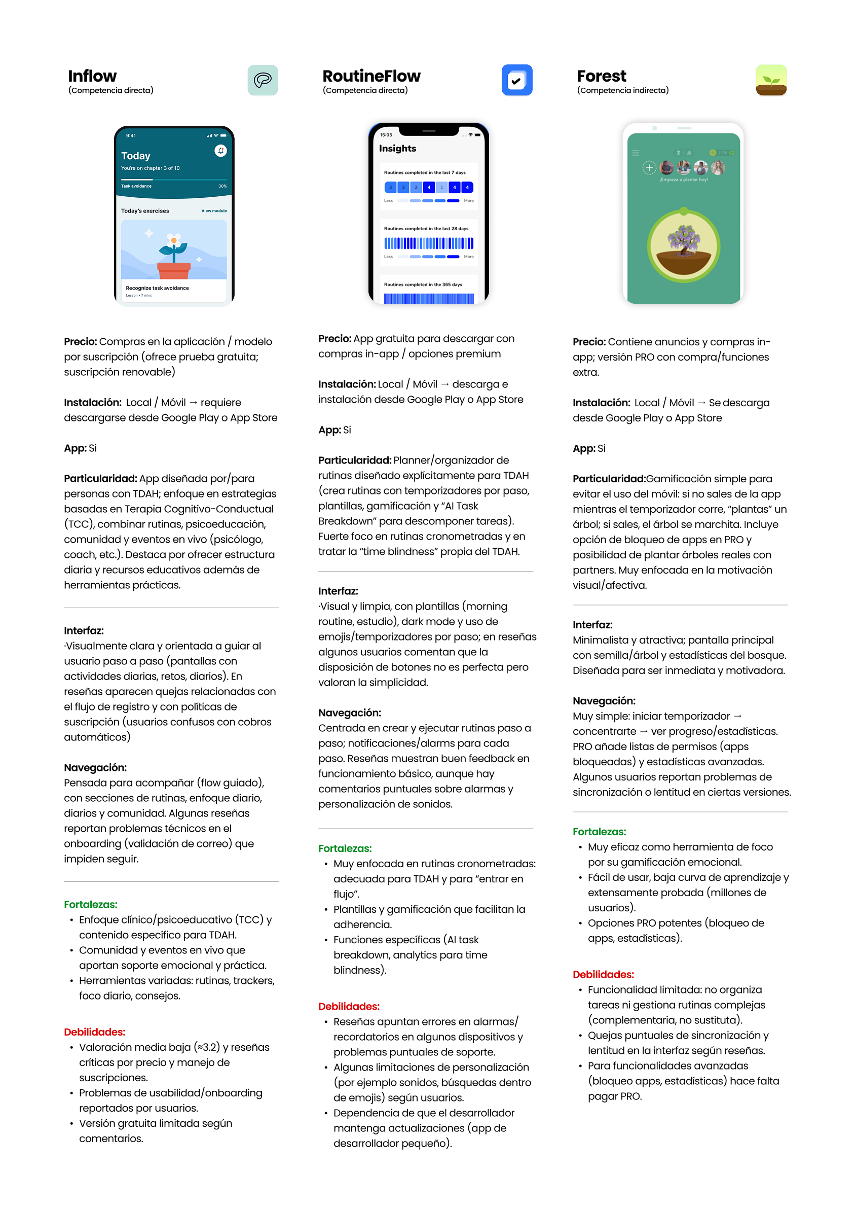
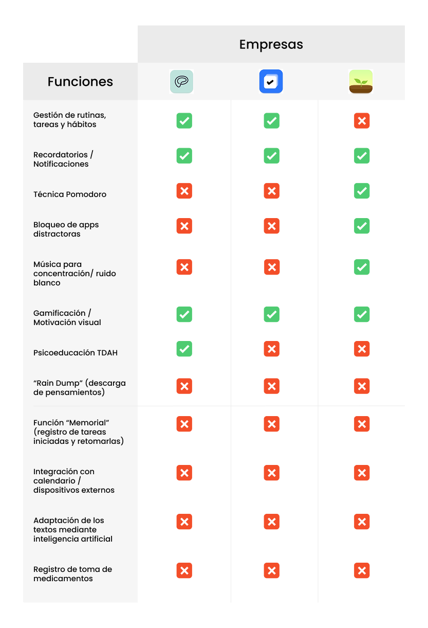
It helped me see, for example, that Inflow stands out in psychoeducation, RoutineFlow in timed routines, and Forest in visual gamification, but none integrate functions like medication logging, Rain Dump, or AI text adaptation.
This allowed for the detection of innovation opportunities and defined how Tedeache can differentiate itself as a comprehensive app.
The objective of the SWOT analysis was to analyze Tedeache from an internal and external perspective.
Strengths: no app combines all the proposed features; integration with calendars and external devices; strong social and educational value; good use of AI.
Weaknesses: new project without a user base or brand recognition; complex technical development; risk of overwhelming the user; need for scientific and educational backing.
Opportunities: growing awareness of ADHD; boom in the digital productivity and mental health market; innovative features like medication logging, Rain Dump, Memorial, white noise, AI text adaptation.
Threats: competition from consolidated apps like Todoist, Notion, or Trello, and ADHD-specific ones like Inflow or RoutineFlow; possible user resistance to subscriptions compared to free or freemium apps.
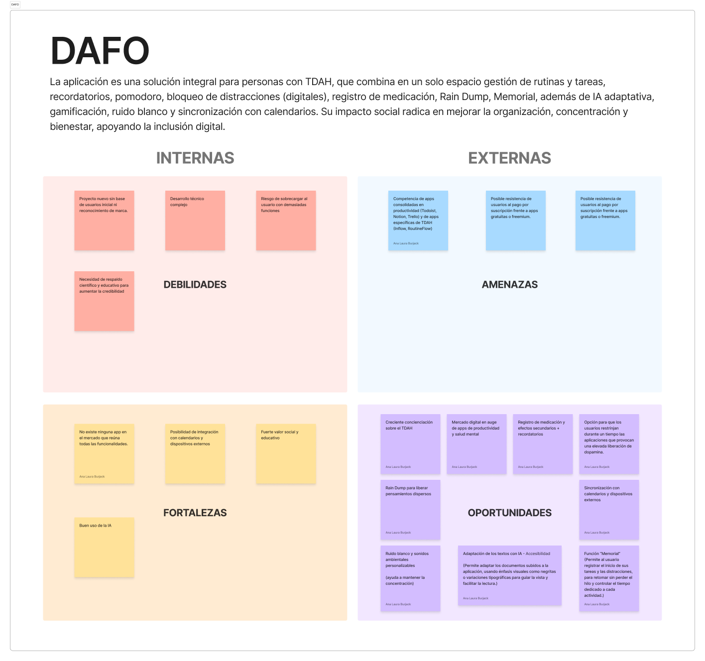
This analysis allowed me to identify risks and limitations, but also to recognize competitive advantages and innovation opportunities that strengthen the proposal in the market, making the project more solid and realistic.
A quantitative technique that allows for the collection of information from a wide group of users to learn about their opinions, habits, and preferences in a structured way. The goal of the survey was to gain deep insight into users' habits, needs, and expectations regarding productivity and ADHD management, in order to validate and enrich the app's features.
Users value features such as gamification (55.6%), widgets and calendar synchronization (72.2% and 66.7%), and journaling and psychoeducation tools like videos and daily tips.
There is interest in innovative features: Brain Dump in text and audio, medication logging with side effects, flexible blocking of distracting apps, and AI text adaptation to improve readability - 94.5% consider it useful. Most prefer flexible and customizable options.
In the open-ended section, they requested instrumental playlists, simplified calendar integration, community, and an attractive interface. White noise and emotional playlists confirmed their value, and the Memorial was validated as "very useful" by 55.6% of participants.
The survey served to adjust Tedeache's key functions to real needs, ensuring that the app covers not only problems detected in theory but also those that users themselves express in their daily lives.
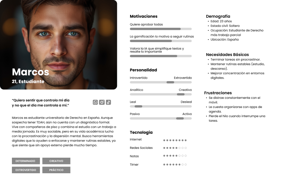
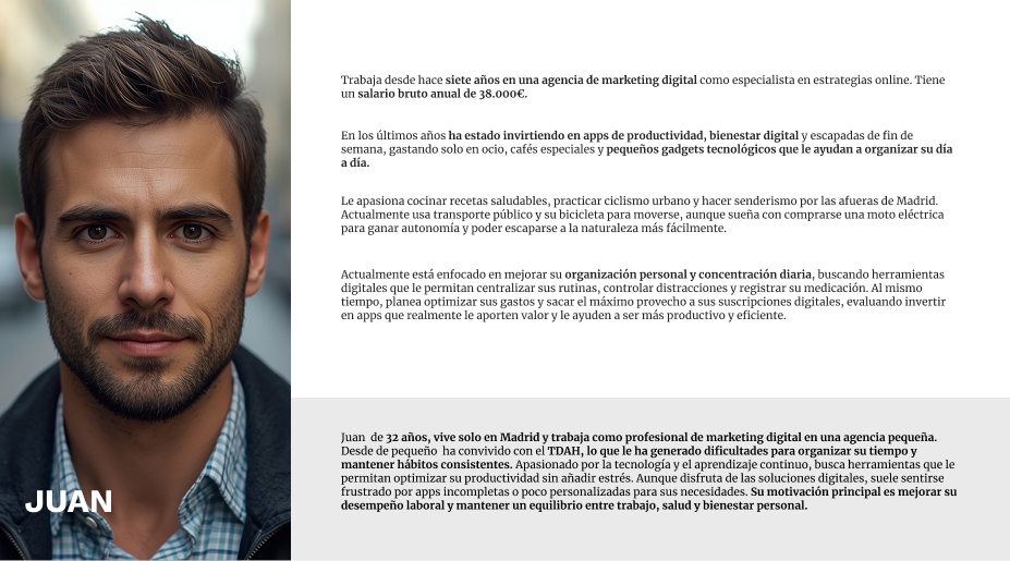
Based on the information gathered in the surveys and interviews, I created user personas that represent Tedeache's main user groups. These personas synthesize the qualities, motivations, frustrations, and real preferences detected during the research, allowing the user to remain at the center of every design decision and avoiding assumptions about behavior. With these personas as a reference, I developed a User Journey Map to visualize the user experience step-by-step when interacting with the app, identifying key moments, pain points, and opportunities for improvement throughout the entire journey.
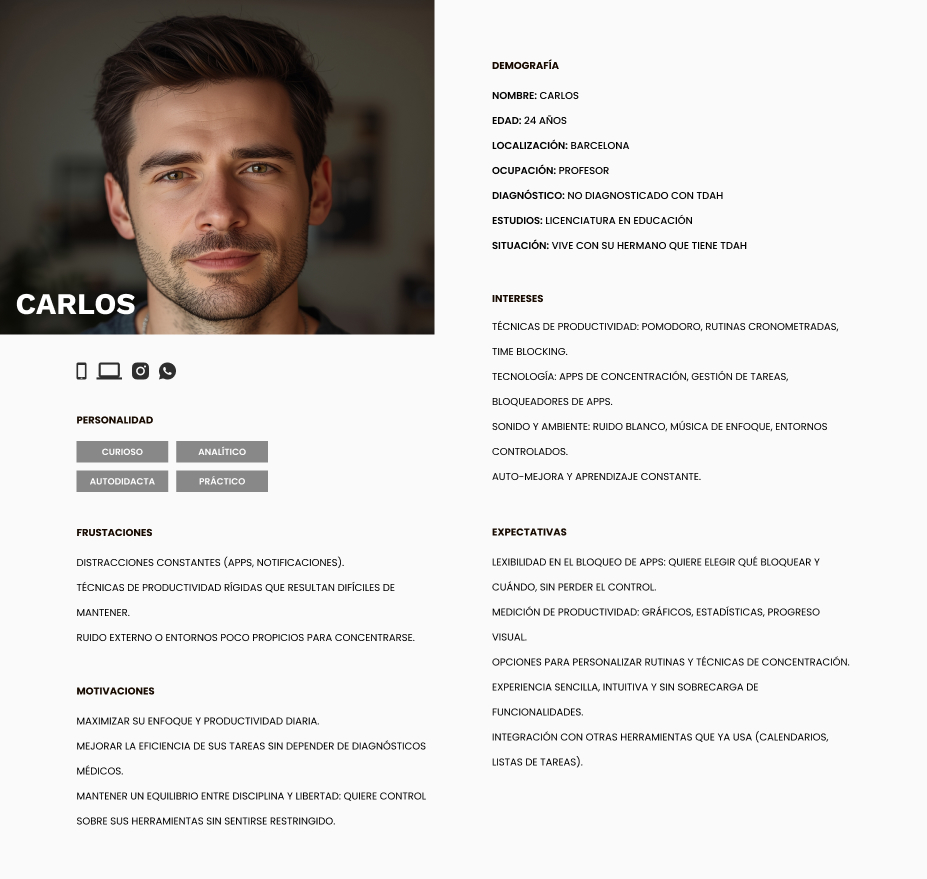
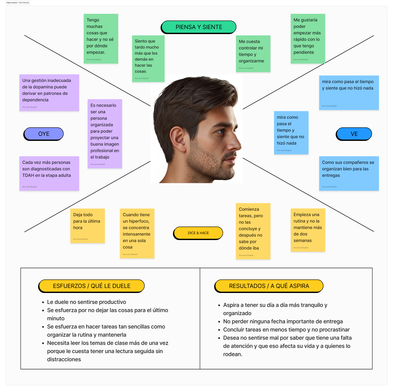
The empathy map allowed me to delve into the user's perspective beyond quantitative data. By visualizing what the user thinks, feels, hears, and sees in their daily life, I identified a significant gap between what the user desires—to feel productive and organized—and the reality they experience: procrastination, uncontrolled hyperfocus, and constant frustration for not completing tasks.
Their main efforts revolve around not leaving things until the last minute and maintaining basic routines. Their aspirations point to a calmer daily life, meeting deadlines, and not feeling bad about how ADHD affects those around them. This tool was key to designing features that respond to real emotional needs, not just functional ones.
Based on research insights, I formulated "How Might We" questions to transform detected problems into design opportunities. These three questions guided the project's most important decisions:
1. How might we help the user resume an interrupted task without losing their train of thought?
2. How might we make the user want to write down their daily thoughts and emotions?
3. How might we reduce digital distractions without the user feeling like they are losing control?
The Value Proposition Canvas allowed me to align Tedeache's features with real user needs. On the customer side, I identified three key dimensions: the tasks the user tries to complete, such as organizing routines, maintaining focus in time blocks, remembering medication, and resuming tasks after interruptions; their main frustrations, such as procrastination and excessive mobile use, having to use several different apps, and forgetting medication; and the gains they expect to obtain, such as greater focus and productivity, simple organization in a single space, and motivation through gamification.
On the product side, each feature responds directly to one of these points: the Rain Dump and the Memorial relieve cognitive overload, the adjustable Pomodoro and app blocking reduce distractions, the AI simplifies texts to facilitate studying, and gamification turns routines into achievements. Tedeache does not add complexity, it eliminates it.
The Business Model Canvas allowed me to globally visualize how Tedeache creates, delivers, and captures value. Regarding customers, the product is aimed at people with diagnosed or suspected ADHD, university students, young professionals, and adults with difficulties in organization and routine tracking.
The core value proposition is being the only app that integrates routine and task management, adjustable Pomodoro, distracting app blocking, Rain Dump, medication logging with side effects, white noise, and AI text adaptation into a single space. The business model is based on a monthly or annual subscription with a free freemium version for the first month, and possible collaborations with health professionals for exclusive content.
The distribution channels are the App Store and Google Play, combined with content marketing on social networks like Instagram, TikTok, and YouTube. The relationship with the user is maintained through constant feedback, surveys, ratings, and personalized psychoeducational content. The main costs include app development and maintenance, digital marketing, and music and ambient sound licenses.
The MoSCoW prioritization allowed me to organize Tedeache's features according to their impact, feasibility, and innovation, ensuring that the MVP was solid without overloading the initial development.
Must-have features — essential — include the Memorial with notifications, text upload in all formats, external app blocking, simplified block calendar, and games to facilitate basic daily tasks. Should-have features — important but not blockers — include the Brain Dump, emotional journaling with a diary, psychoeducation snippets, and AI to organize tasks by priority and estimated time.
At the Could-have level, a meditation space in the Brain Dump and an online library of accessible books for people with ADHD were placed. Finally, it was decided not to include in this version a complex integrated timer system in the task list with multiple pause options, as it was considered it would add unnecessary friction for the user.
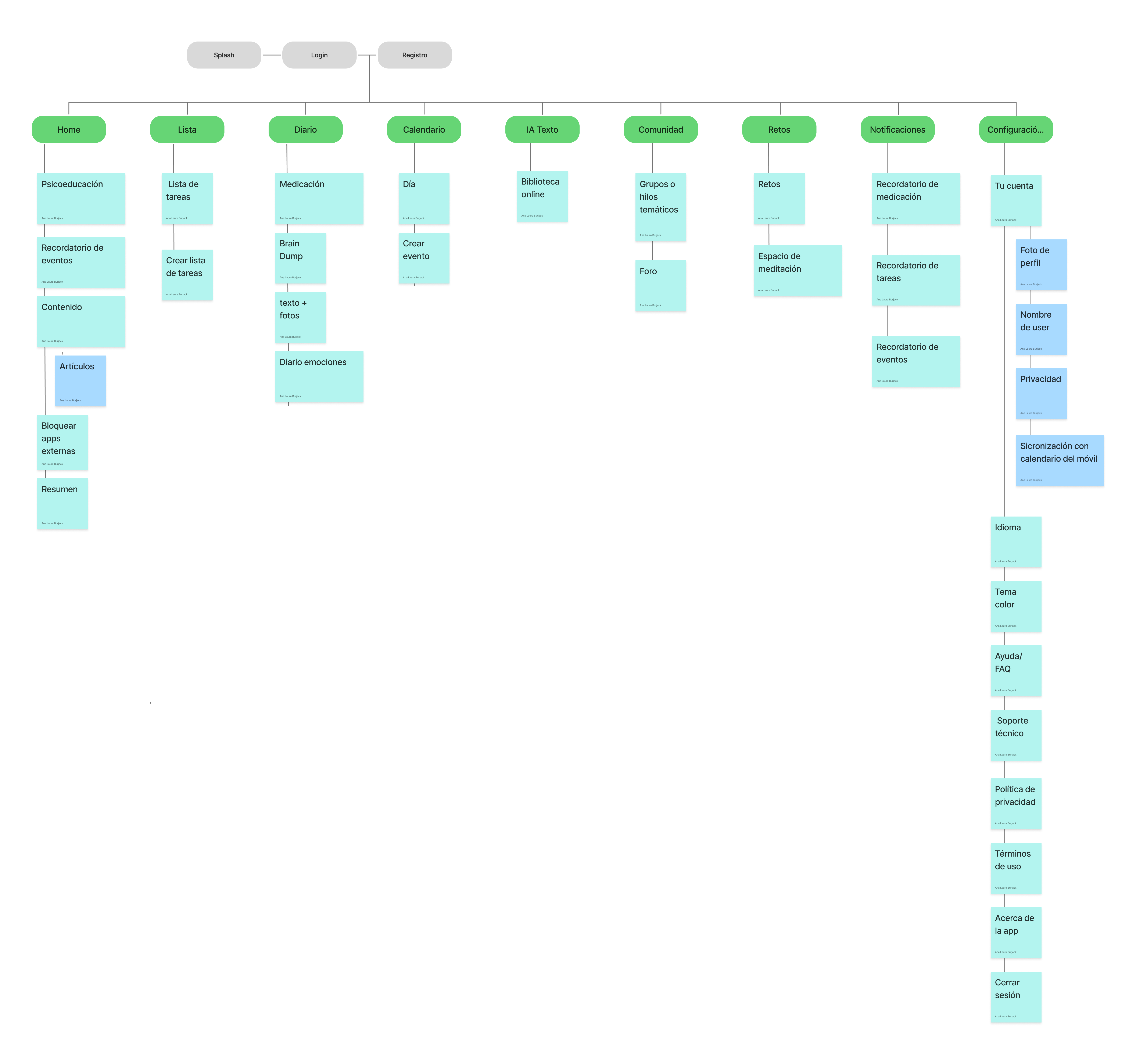
Information architecture defines how an app's content is organized, structured, and labeled so that users can find what they need intuitively. It is a critical phase of the design process because it determines navigation, screen hierarchy, and the relationship between sections before drawing a single screen.
To build it, I previously performed a Card Sorting session, a technique where users group and name content according to their own mental model. This allowed me to validate that the proposed structure matched how the users themselves expected to find the information, thus reducing the learning curve and friction during use.
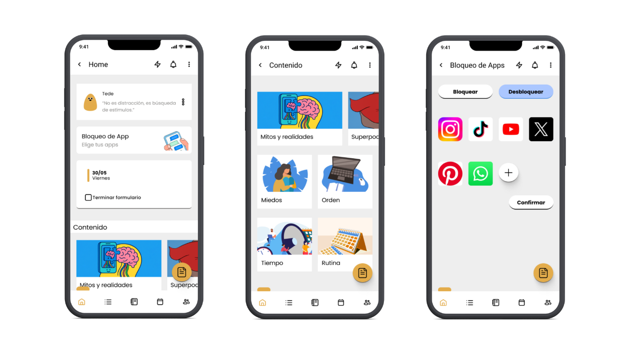
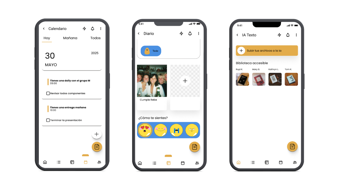
The result was an architecture organized into nine main sections: Home, List, Journal, Calendar, AI Text, Community, Challenges, Notifications, and Settings, each with its own content hierarchy and accessible from the app's main navigation.
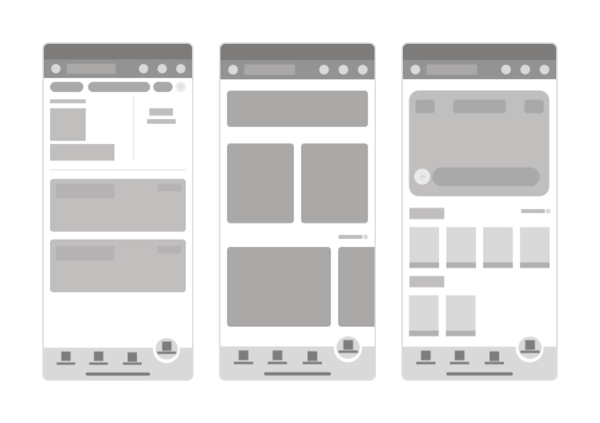
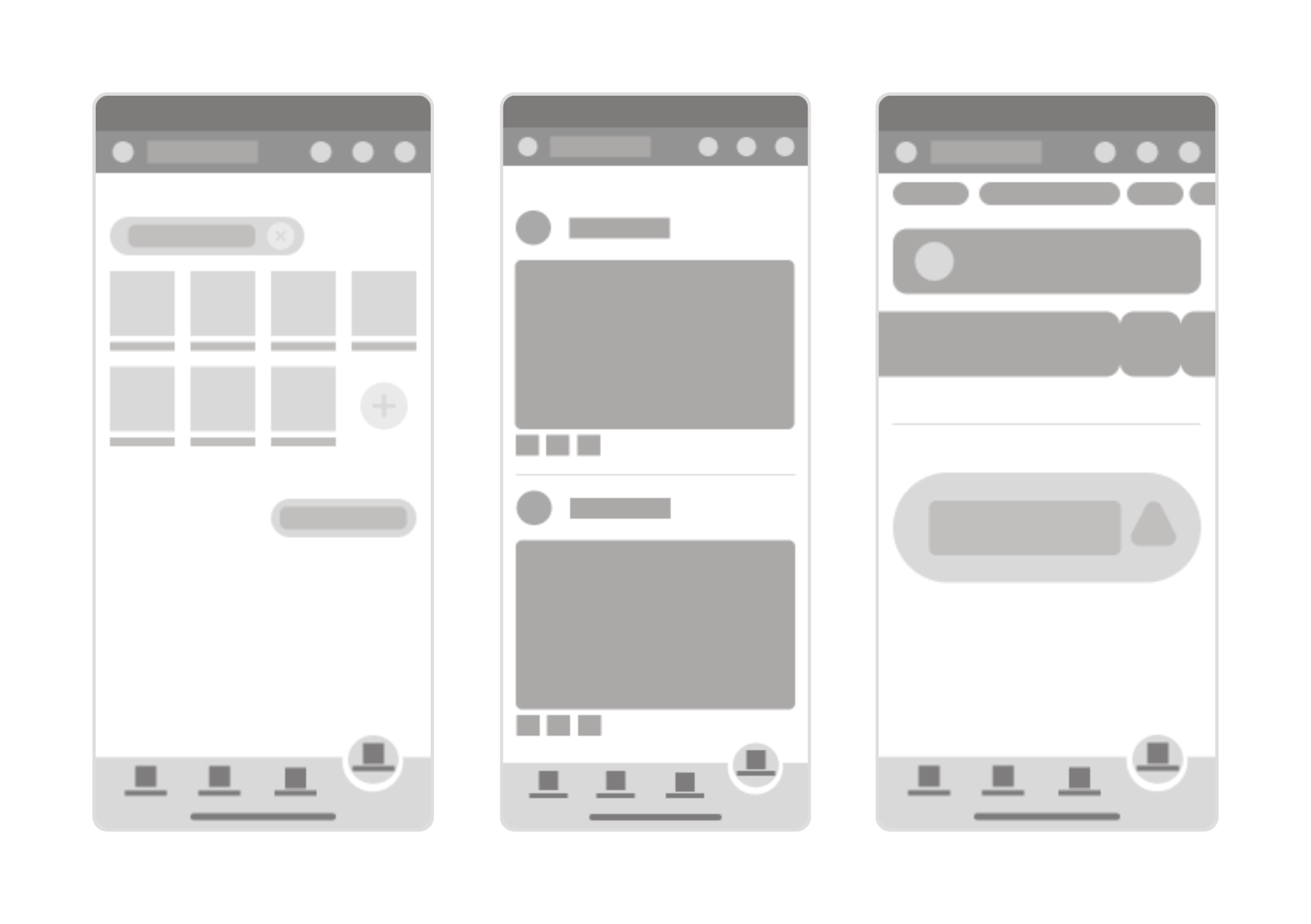
With the information architecture defined, I began the visual ideation phase by creating low-fidelity wireframes. These initial sketches allowed me to explore the distribution of elements on the screen quickly and without being influenced by visual appearance, focusing solely on structure, navigation, and content hierarchy before moving on to the high-fidelity prototype.
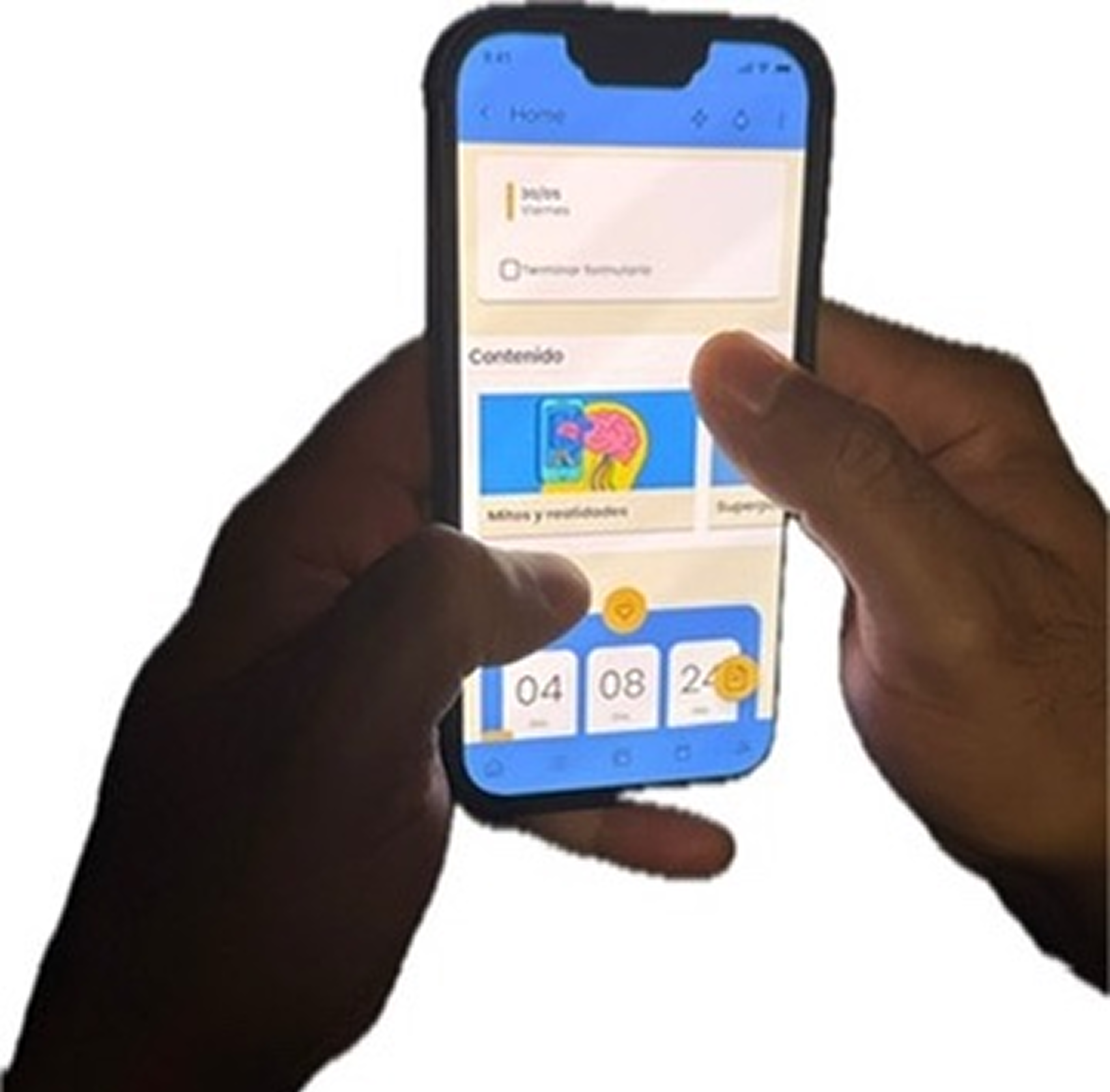
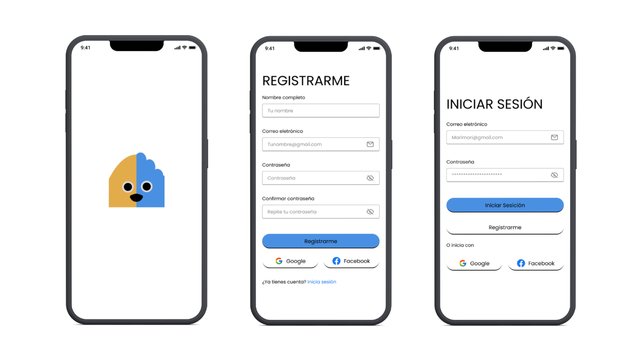
With the wireframes validated, I moved towards the user interface design. In this phase, I defined Tedeache's visual system: color palette, typography, iconography, components, and interaction patterns. The goal was to create an accessible interface, visually coherent and adapted to the cognitive needs of people with ADHD, prioritizing clarity, simplicity, and the reduction of visual overload on each screen.
"I felt calm, motivated"